

August 3, 2011
December 24, 2010
It's Not About You...
Hey everyone, got a few updates for everyone as well as a new post. With the holidays and closing out the residence halls at my school, I've been pretty busy in the Photoshop department but I have good news. I've been working on something evolutionary. I've been carefully designing the layout and typography of my new web page. Think of it as an online business card including a bio and links all of which makes up your online footprint. Below is a condensed version of the background image I used for it. The name of the site is about.me and it's truelu quite genius. Check me out at about.me/chasani. This site is a fully customizable template that allows you to select either your own photo, or a slue of preloaded images for your background. From there you create a title, header, and small bio with the array of fonts given. In the creation of this, I discovered a new design technique, shown very soon.
Next thing to get out the way, is less than pleasant. I have unfortunately crossed over the to dark side and will now be attaching advertisements to the blog. It will just be 1 advertisement at a time and be hardly noticeable, but I'm low on cash and could use some form of monetary compensation for my work. Life of a college student right? I promise to keep it from being annoying and to keep your experience here at Des-Evo still as pleasurable and exciting as ever.

Next thing to get out the way, is less than pleasant. I have unfortunately crossed over the to dark side and will now be attaching advertisements to the blog. It will just be 1 advertisement at a time and be hardly noticeable, but I'm low on cash and could use some form of monetary compensation for my work. Life of a college student right? I promise to keep it from being annoying and to keep your experience here at Des-Evo still as pleasurable and exciting as ever.
Now that the stupid stuff is taken care of, lets get to the fun part.

This picture, as mentioned earlier, is the layout to my new web page. I wanted my about.me to give a hint of my skills and still give a picture of my beautiful face (considering that will attract more people than anything). Making a long story short, I stumbled this style of giving the image of cracks being on a face. There really is an art to this besides downloading crack brushes, applying them, clicking overlay and being done. Let's see how...
Find an image that gives off a dark and gloomy look, it'll really set the mood.


Now you're ready to begin, but before you do prep your picture. No one wants a bright, pretty picture of their face peeling off... Go to Image --> Adjustments --> Levels. Mess around with this to give the natural shadows of your face more distinction.

Now you're all set and ready to go.
Now the usual procedure is as follows:


Now you're all set and ready to go.
Now the usual procedure is as follows:
- New layer
- Apply brush strokes (from the cracked set you just downloaded) on the new layer
- Overylay
- blah blah blah
Follow these tips to make it professional grade:
- Create two copies of the original picture.
- From there select the area in which you plan to "crack".

After that, while still keeping the area selected, Desaturate the new layers.

For one of the layer copies (order doesn't matter), repeat the above step that dealt with using the Level adjustment. This will increase detail when you change the blending options of the layers.

For the next one, use the Hue/Saturation to create a satin type of feel across the area. This will enhance the cracks. Make sure you have the colorized box checked off.

Now create a new layer on top to apply the brushes, apply accordingly and hit Overlay. When choosing a color for the brush, take note of a few things; on light and fair skin, darker brown/black is prime. For darker complexions, white gives an extra subtle effect. Also, as you will see, it would be wise to check out the color scheme of the picture. Be creative and color your cracks in association with the picture.
On this very layer, right click it go to Blending Options --> Inner Shadow. This can separate a good crack from a great one. Increase the distance of the shadow

Now just let the top 3 layers go into Overlay. Some pictures may be to dark, take out the desaturated layer without the Hue/Saturation.
Also something to do its after your done, select the entire person, inverse selection, feather it a bit, and delete it. Make sure you have a white background, you now have a glow amongst your picture. Be creative, try something new.

November 27, 2010
Design Evolution à la mode
Boy has it been a while. Months since my last post, I come to you at the climax of my Thanksgiving break bringing a new face to Design Evolution. Now the most important aspect of this blog is to live to its name and motto. Design Evolution must, in fact, be Evolution as Advertised. So what I've done is give a new face to DE and created its own magazine! Well, without the official magazine print outs... and content. Actually, all I did was make a cover. But in this magazine cover lies the next step onto true evolution is the design world, at least for a beginner such as myself.
Now there two design ideas I had in mind. Originally this started as just an effort to create magazine covers. I figured that would be a simple way to make money, definitely good experience. In the processes of this not-so brilliant idea, I became detached from my passion of Photoshop do deal with real world college responsibilities. In hopes to please you I decided to include another design ideal to the post, and that is the art of digitizing, something I most literally stumbled upon. Followed a tutorial without much of my own creative design. Through out the week I plan on doing two major things to this photo. First, I want to perfect the digitization. I think it's a great concept and when perfect can aid in a lot of future projects. Second, I want to work on my typography. This is important in the graphic design world, and I feel this will help me in my future.
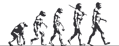
Where is the evolution? Well while I further this project, I will be putting up side by side by side pictures of my original creation and the two large edits. Sort of like the Evolution of Man photo.


As implied, click picture for full size image. Don't forget to provoke my unsettling fetish for constructive criticism! If you see something else that needs to be edited, comment below, it'll be monumentally appreciated!
Now there two design ideas I had in mind. Originally this started as just an effort to create magazine covers. I figured that would be a simple way to make money, definitely good experience. In the processes of this not-so brilliant idea, I became detached from my passion of Photoshop do deal with real world college responsibilities. In hopes to please you I decided to include another design ideal to the post, and that is the art of digitizing, something I most literally stumbled upon. Followed a tutorial without much of my own creative design. Through out the week I plan on doing two major things to this photo. First, I want to perfect the digitization. I think it's a great concept and when perfect can aid in a lot of future projects. Second, I want to work on my typography. This is important in the graphic design world, and I feel this will help me in my future.
Where is the evolution? Well while I further this project, I will be putting up side by side by side pictures of my original creation and the two large edits. Sort of like the Evolution of Man photo.


Update!
First Edit
- Decided I wanted a more prodigious appeal. I decided to show the entire picture, and digitize much more of his body. Unfortunately, the back of his head was cut off... but thanks to the divine minds of Adobe©, I was able to draw out what I needed to be done with the lasso tool and used Content-Aware Fill for the rest.
- Saw the blocks coming off his face and body were too... block like... so I figured it would be best to get a more realistic feel (if possible). As shown below, I found the motion blur, set it to 90°. This gives a slight feel for moving up and down, but hopefully just up in this case. The actual number of Distance you want your pixels will all depend on the the picture and its size.

Second Edit
- This edit was strictly for the layout and text. Even though I was in love with the original title, I felt it wasn't showing any form of real design. Also, the genius slogan, "Evolution as Advertised", seemed lost in this pseudo A4 jungle. Right click the layer ("Design" in this case) and select Blending Options. Here you will find Bevel and Emboss. Here are the actual attributes I used. I did the same for "Evolution" except just with slightly different characteristics.

- Next came the rest of the layout. I realized a few things when referencing other magazine covers. A rather obvious concept, never cover the model's face. In this case, the face is important, but the design itself was what needs to be seen. So I did my best to arrange the layout in a way that allowed the viewers to get the best view of the back design.
- Accompanied with the layout design, is the actual text design, or typography. I am no skilled typographist, (no, this is NOT a real profession... or word) but what I did was to try and implement my own low-level text design. Not much I can elaborate, but what I would like is some feedback on how I can approve, because we all know I can.
- Lastly, I realized a few elements of a magazine I was missing. Bar code, price, and date. Didn't know how to fit it in accordingly without altering the layout entirely. Don't need to write a paragraph explaining that I, in fact, added these.
As implied, click picture for full size image. Don't forget to provoke my unsettling fetish for constructive criticism! If you see something else that needs to be edited, comment below, it'll be monumentally appreciated!
July 31, 2010
Evolution As Advertised
The background of my computer was getting old and my posts scarce. And of these few posts even fewer accurately depict the main focus of the blog. Here I change this. I decided to help myself out by creating a new background using the tutorial presented in the last post and at the same time show you a very general time line on how the picture was created. This could not have been possible if it wasn't for my new camera (also presented earlier). So here I show you what this blog really stands for and I hope for your feedback to keep this thing alive.
*DISCLAIMER* These pictures are way to big to put onto the blog, in the future I will condense them**
My friends tell me the picture of me on this blog is not as professional as it rightfully should be. I decide to experiment with my new camera taking "sophisticated" photos of myself when I came across a pose I really enjoyed. The way the picture came out I thought would be perfect for my next project of text shadowing. I kept retaking the photo and decided to chose this one [x]. From there I learned the tutorial in and out. On a quest to find a word to show my pretty face, my friends told me they loved the new passion I developed of Photoshop and blogging so that is what I went for. This was my final product, at least that's what I thought [x]. Realizing anyone could follow a few clearly labeled instructions I decided to take it to the next level, evolve it if you will. My favorite song that most accurately displays my first year of college is Over by Drake. For a picture of me I think this would best to, quite literally, show people who I am [x]. Now considering my camera takes pictures at an unnecessary 3888 x 2592 resolution, I had to find what I believed to be the font, size, and spacing of the lyrics. Also I thought adding my own footprint into the photo by adding a refined Design Evolution logo to the picture [x] . Now to add its own original feel to it I decided to finish off the photo with a simple multi color overlay to give it some real effect. Thus the results are as shown:
 |
July 8, 2010
Hardware Update
It seems I have taken a lengthy posting hiatus but for good reason! I started my second job last week and the original reason I got this job was to gather enough money to pay for a new rig I was going to build. Reason for said rig was that my old one s@#! the bed. Luckily, after both Best Buy and IBuyPower.com (where I bought the computer) said they couldn't run a diagnosis I decided to go through my own set of hardware diagnostic tests. Come to find out my GFX card blew, which I guess is better than my motherboard, but still an expensive set back.
 Luckily for me I still have both jobs which allowed me to get the captivating Canon EOS Rebel XS 10.1 MP. My second camera ever and most certainly the one with the highest caliber. This will now allow me to take my own high quality pictures where I can create my own image not just through Photoshop, but through my own eyes without the limitation of an image search engine. Also I've created a wish list which I leave detailed later on with only the relevant items to my work.
Now as my productivity should be seemingly on the rise, I must admit my blessing is my curse. The 2 jobs help exceedingly over time, but this very time will serve as my greatest obstacle. I work either 4 hours a day, 8 hours or 14 hours. My days off I am forced to take myself to the realm of the outdoors where this so called "social life" will be turned upon me. In the mean while when I'm not dying from exhaustion or mingling amongst my friend(s), I'll be taking and creating my own stock photos for any kind of project I have in mind. My next project will be following this video.
The Wish List
[x] GeForce GTX 470 (Fermi) 1280mb w/ 6ft. hdmi cable
This on top of my dual 3.33ghz processor should allow me to run Photoshop CS5 and hook up my camera to my computer. Doing this will enable me to take a picture and have it instantly transfer to my computer for a quick editing all in full HD.
[x] Samsung 32-inch LCD 1080p HDTV
This larger than life monitor paired with the video card and cable previously mentioned will let me view and edit my photos and projects with surprising detail and accuracy.
The money isn't quite there but I guess that is why I called it a wish list and not a shopping list.
June 21, 2010
Fruit Bat Or Rabid Pacman? You Decide.

**Newest Update**

a defined lip i couldn't decide where to cut it off at, so I made a selection and feathered it a bit. Same with the dorsal fin. Tell me how it came out. (btw the extra side fin and eye just weren't coming out for me, I'll probably keep trying)
** **


--------
On a side note, I have undergone some recent and significant hardware changes. These drastic changes are accompanied by both good and bad news. I have decked out my room to increase productivity by separating the desktop and laptop which were previously both at my desk. Putting the desktop to my TV will now allow me to use dual screens for my laptop proving to be a much more efficient working environment. Also on the good side I have acquired a new Microsoft mouse and HP keyboard shown here.
Now for the bad news: Although I did fix my desktop after its crashing (yay!) I unfortunately diagnosed the real issue. A blown out video card, my $400 GeForce 8800 gtx tanked on me. How sad. I'm now saving up for the Geforce gtx 470. Until then, my laptop is now my weapon of choice.
June 16, 2010
A Magician Never Reveals His Secret...
Magic Text using Photoshop CS5

So stumbling across YouTube I find this neon looking text with a mystical type background. After what I thought to be my computer screaming "CLICK HERE! CLICK HERE!", I decided to embark on what soon to be an epic adventure in the art of Magic Text. This outspoken link brought me to a tutorial. Now this tutorial opened the gateway of what will soon be the base and foundation of my Photoshop career and furthermore, this blog. The tutorial I found was made in Photoshop CS3 and luckily it worked in Photoshop CS4 which, at the time, was the current version of Photoshop. After learning this tutorial to the very brush stroke I began making these text effects out of personal amusement. Later I received a request from a friend to use his name in this effect and all of a sudden i'm popping out Magic Text like babies after WWII (the baby boom for those who are historically challenged...). The album posted below are some of my better work using Photoshop CS4:
So posted below, in Photoshop CS5*, is a speed painting of magic text. As I went through it with CS5 I met a lot of turbulence in my creations and had to edit the routine slightly. Using black and white where colors once were and Overlay instead of Color. Luckily for you I will be proving my own title wrong and creating a tutorial on the differences in Photoshop CS3 Magic Text vs Photoshop CS5 Magic Text. Also, as always, I added a few things of my own just to give some extra spice to my work.
*I do plan on reviewing Photoshop CS5 and explaining the newest features and major differences granted the public demands so. Please comment your feedback on the photos, videos, and idea for a review.
Subscribe to:
Posts (Atom)


![[x]](http://i872.photobucket.com/albums/ab283/CJphotoshop/IMG_0002_1.jpg)
![[x]](http://i872.photobucket.com/albums/ab283/CJphotoshop/textshadow.jpg)
![[x]](http://i872.photobucket.com/albums/ab283/CJphotoshop/textshadow4.jpg)
![[x]](http://i872.photobucket.com/albums/ab283/CJphotoshop/final.jpg)